Challenge
Help Dollar General (hypothetical client) better understand and optimize their overall in-store and digital user experience.
Solution
Research report summarizing key insights and design principles for the client.
Team
Julian Walker, Lucy James, Jiafeng Zhu, Brayan Pabon
Background
Within the context of a UX research course at the IIT Institute of Design, our team of five worked to carry out, analyze, synthesize, and present a full user research study for a hypothetical client.
For our client, we chose Dollar General, the American chain of variety stores, due to the fact that their customer base is largely low-income and this project could give us an opportunity to help understand and improve their shopping experiences. We focused on the in-store and digital user experience of Dollar General through various qualitative and quantitative research techniques.
Research
Heuristic Evaluation
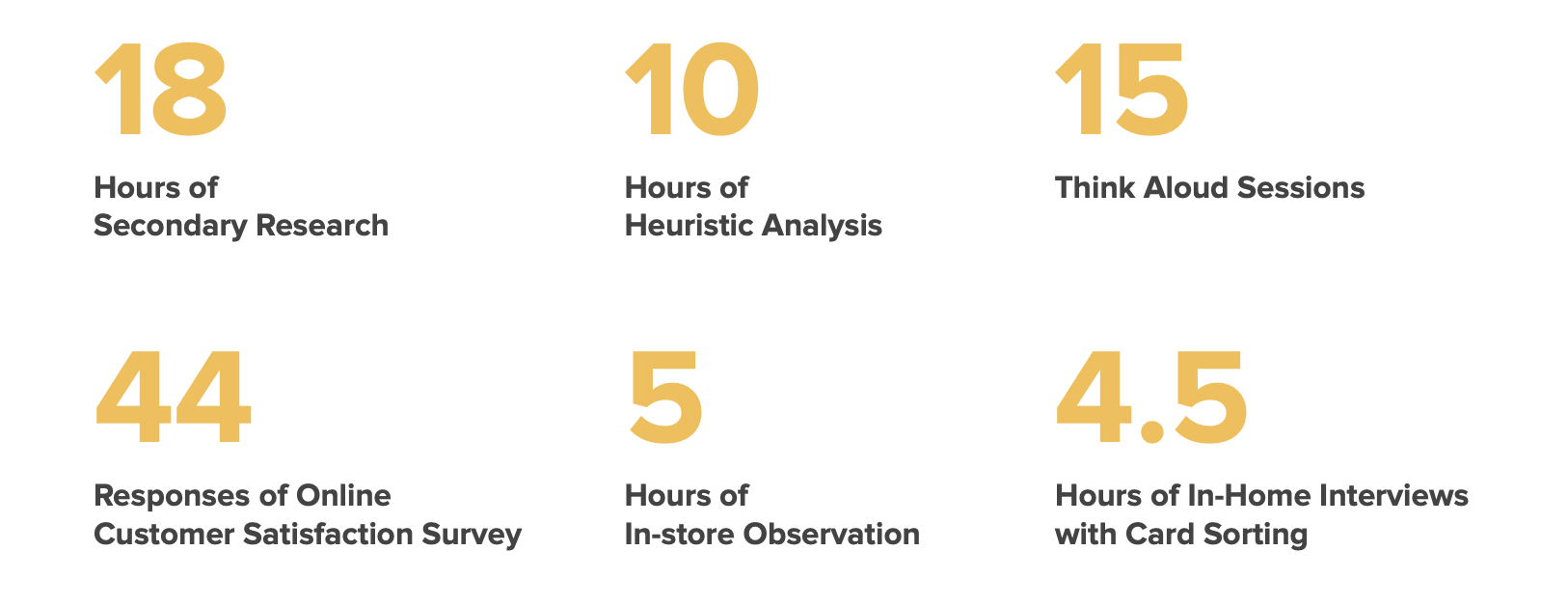
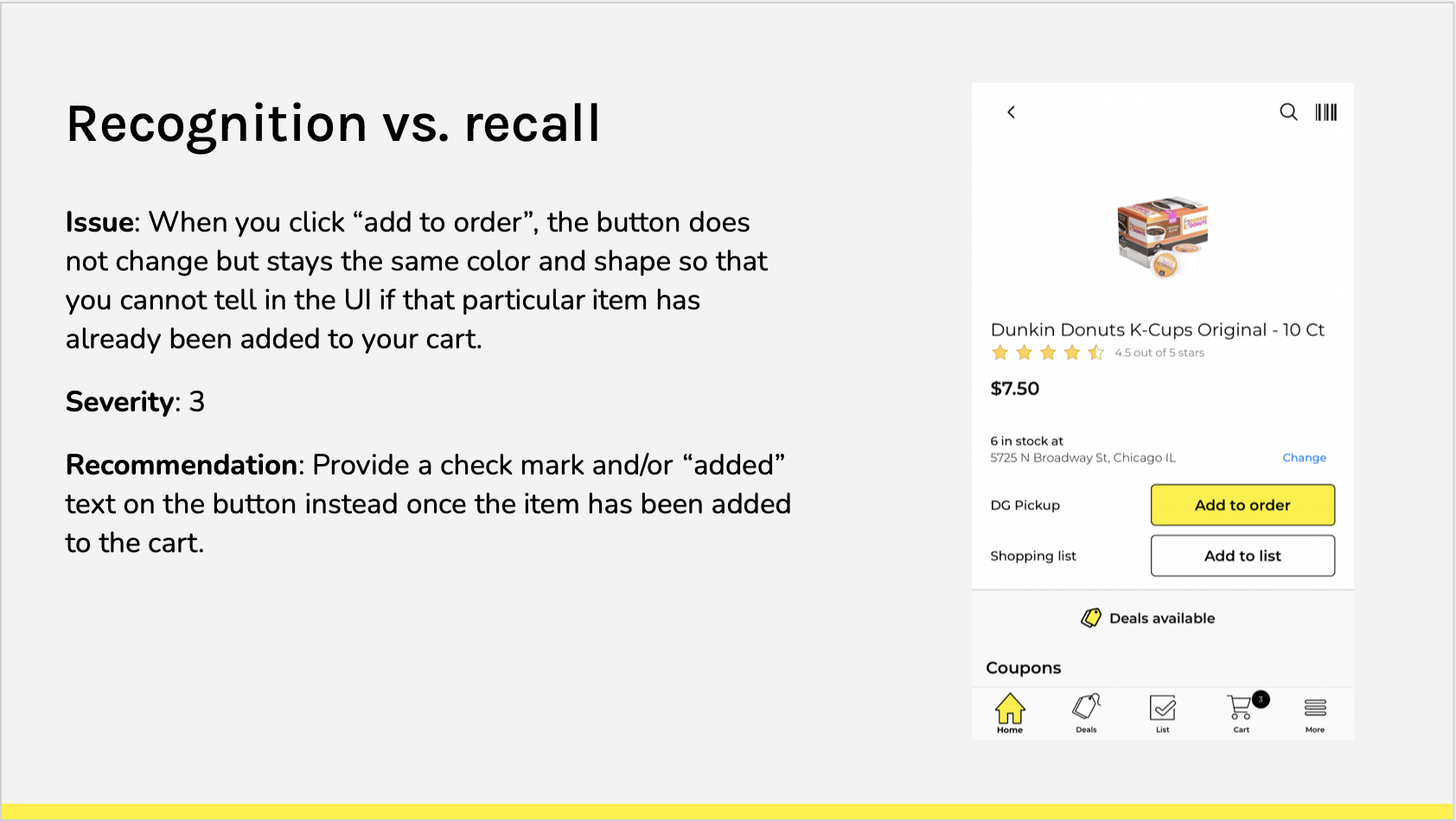
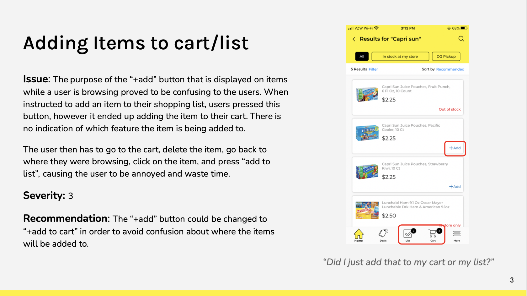
Based on Nielsen’s 10 heuristics, I identified usability issues in Dollar General’s app experience. View the full report here.
Think Alouds & Task Analysis
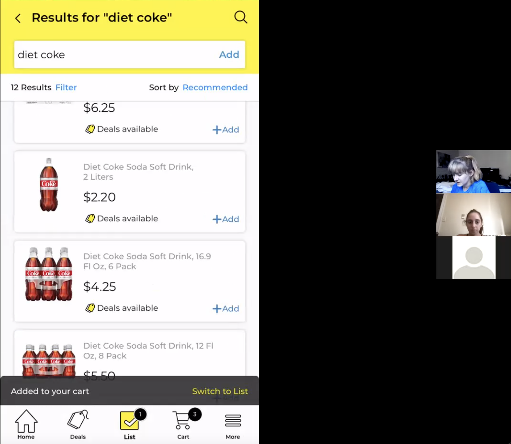
I conducted think aloud interviews with three different participants to observe how users actually interact with the technology.
Observational Research
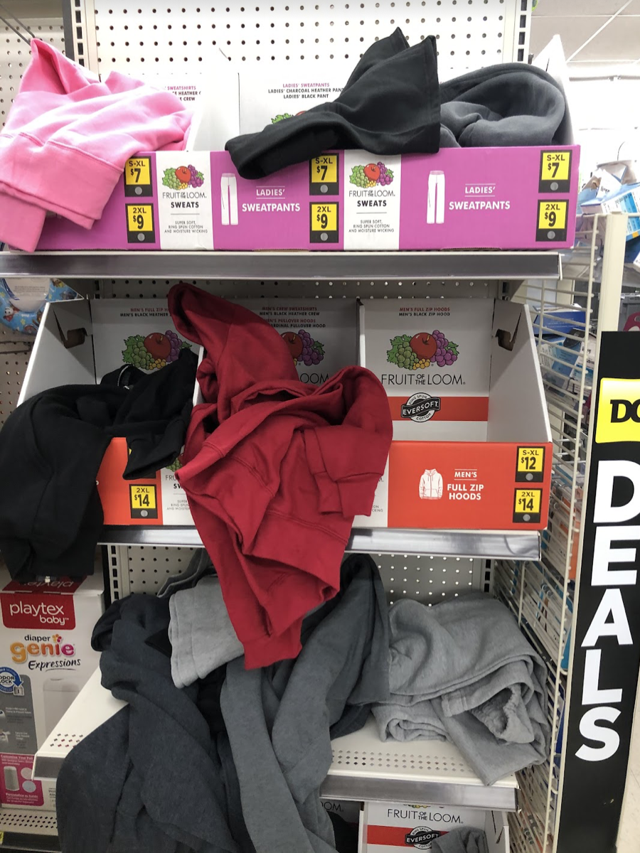
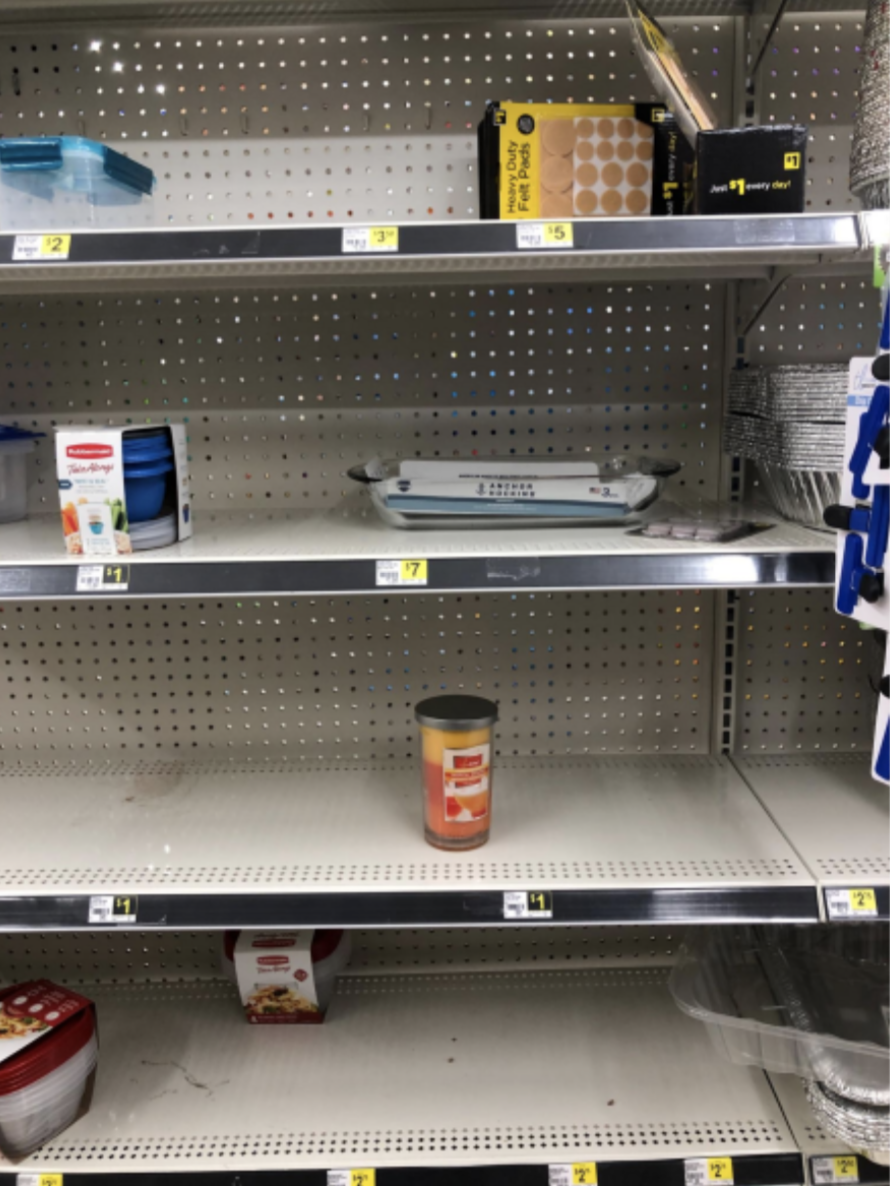
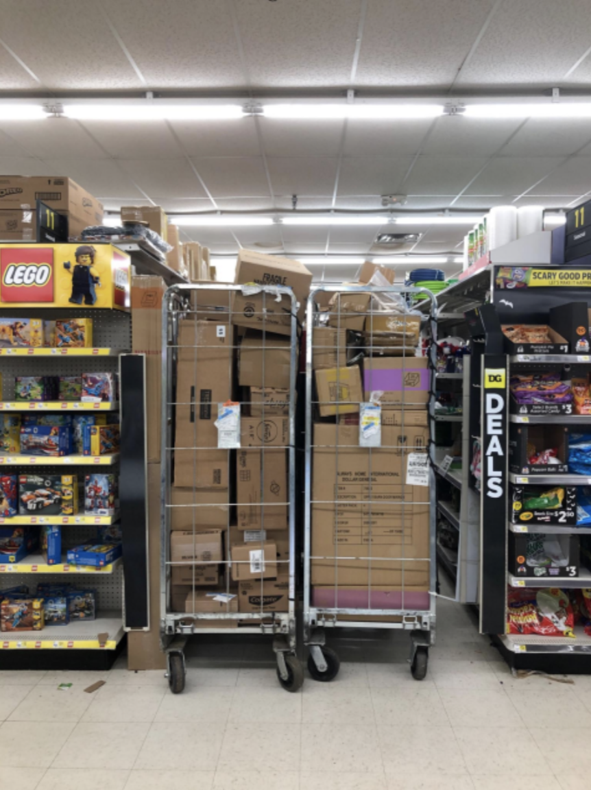
I conducted on-site observation at a Dollar General location for further empathy and understanding of the customer experience.
“We just received a big shipment, and I’m the only one here.”
The store was out of shopping carts for their customers to use, there were shipments in the way that were blocking customers from viewing certain aisles, many of the shelves were either empty or cluttered, and I also observed a lack of fresh food. They seemed to be understaffed as well, as when I arrived, an employee mentioned that they had just received a bit shipment in, and she was the only one there to organize.
Survey
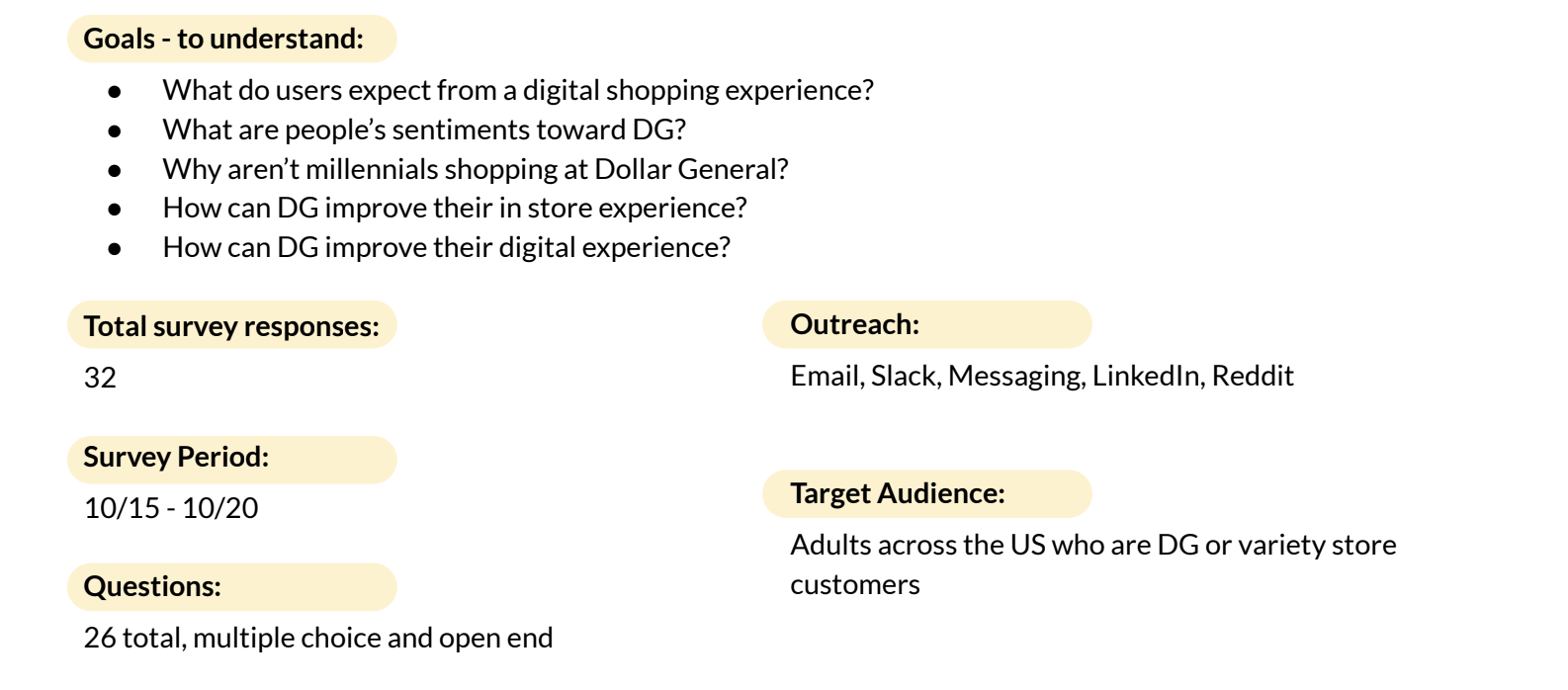
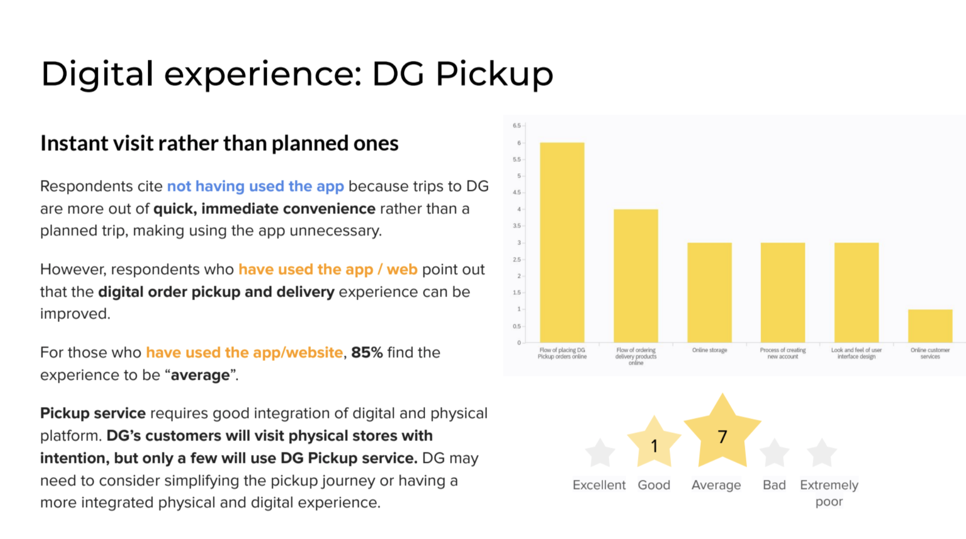
Our team created a customer satisfaction survey to help gain perspective on how users feel about the current Dollar General experience.
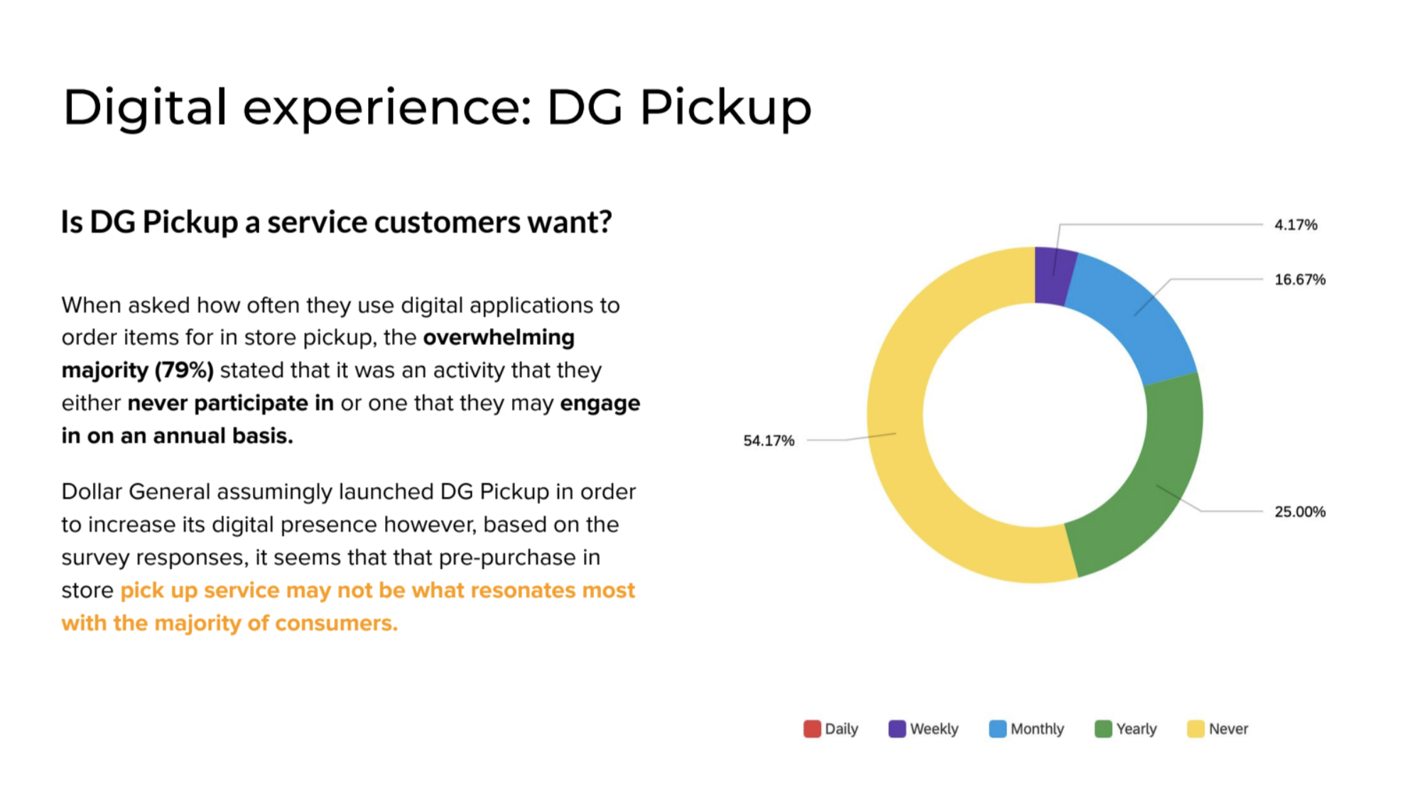
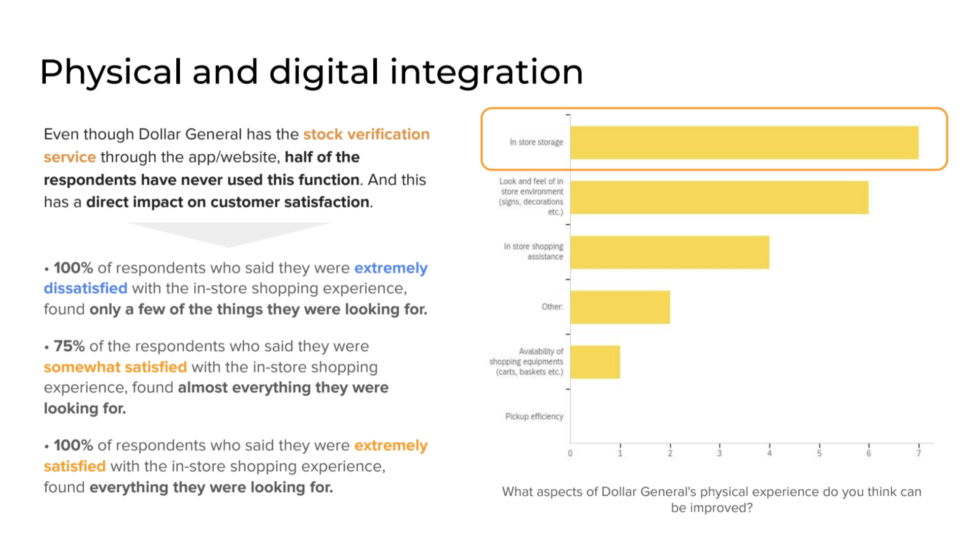
Home ethnography + Card Sort
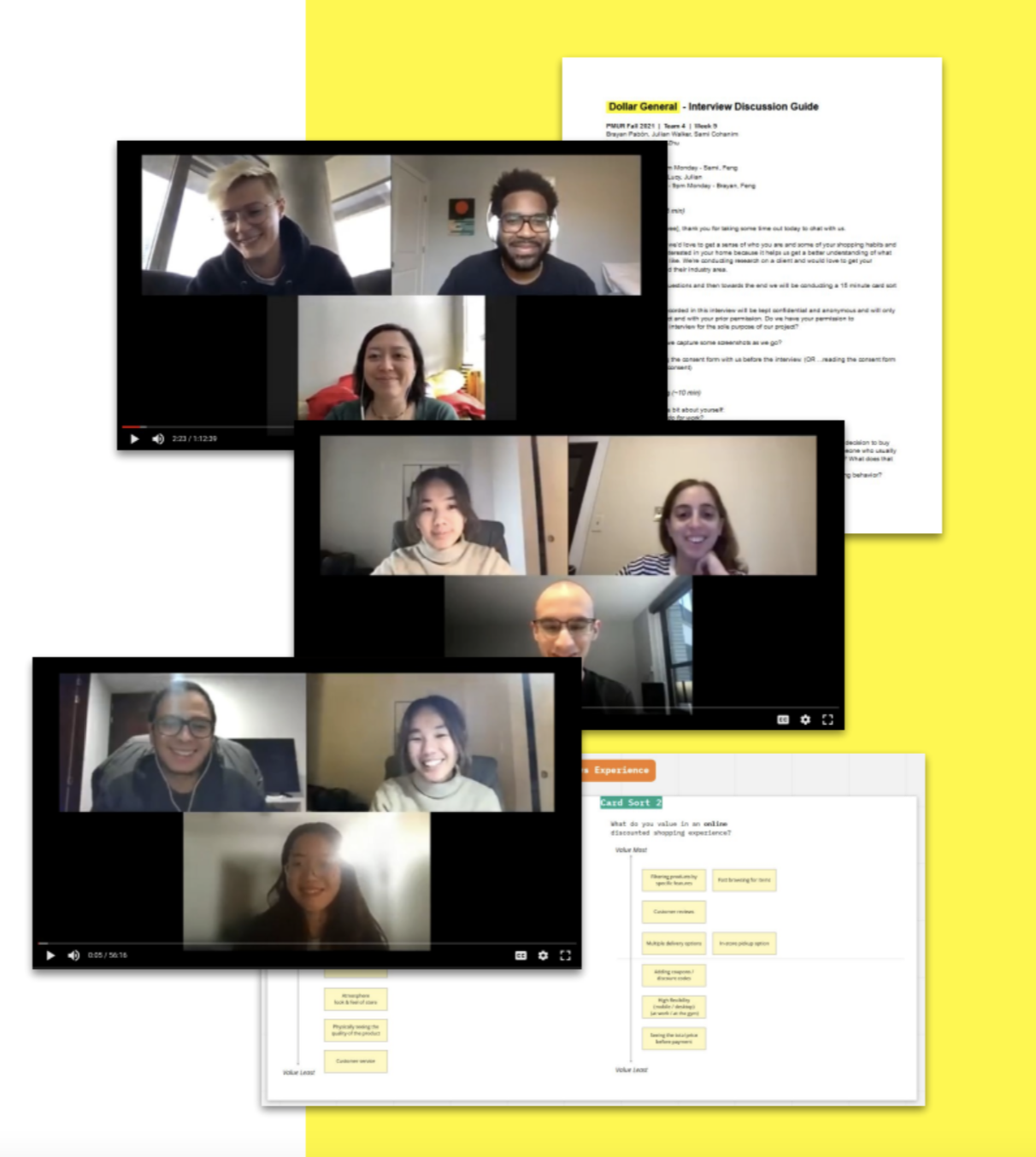
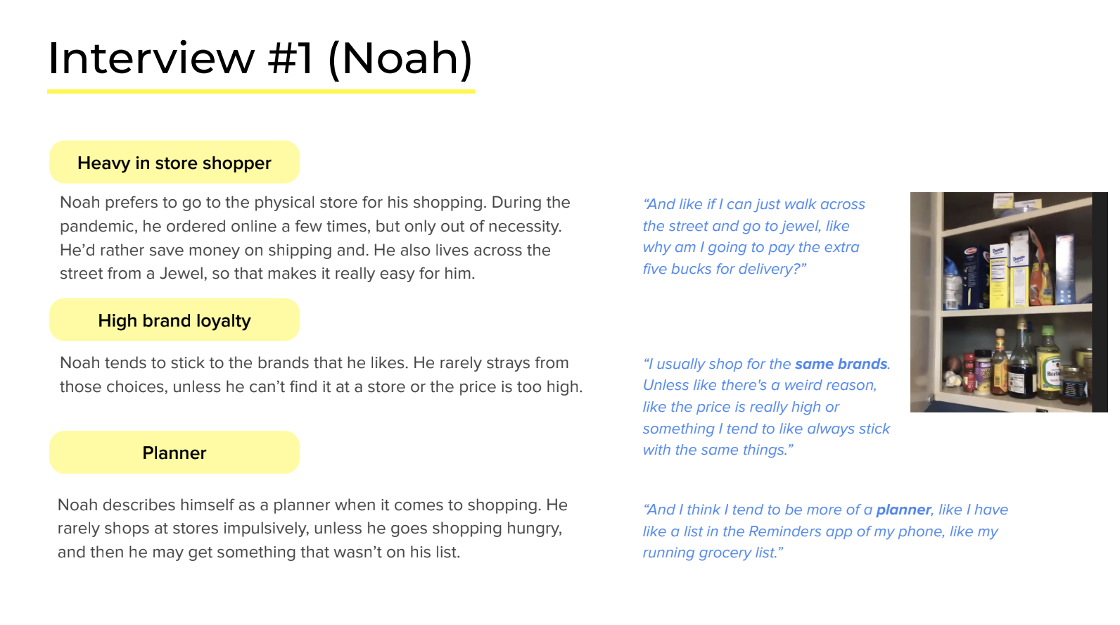
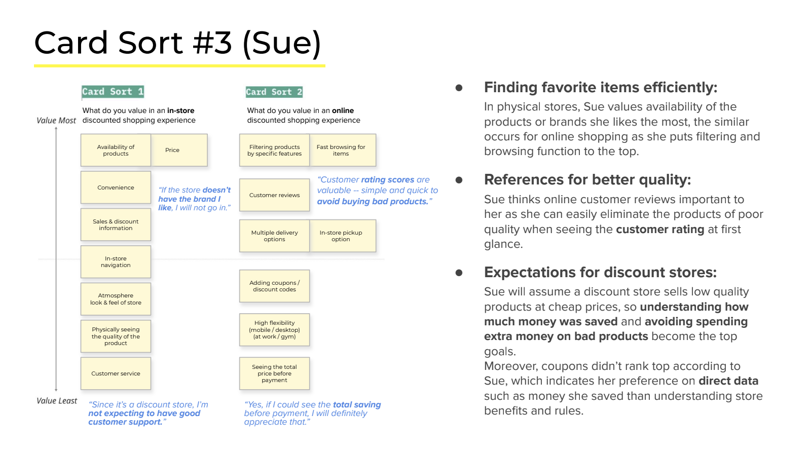
Now that we had an emerging understanding of the issues the Dollar General is facing, it was time to go in-depth into the users and their needs. We conducted virtual in-home interviews with three participants based on a detailed written discussion guide to understand their experiences with Dollar General and variety stores. We also conducted a digital card sorting activity using Miro, where the participants could prioritize what they value most in in-store and digital experience, given a set of cards.
Synthesis
Storytelling Frameworks
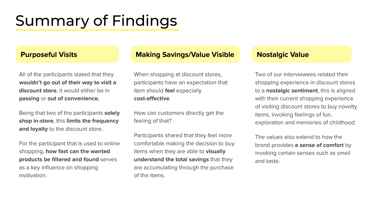
With a host of qualitative and quantitative data gathered, I began to distill what I learned into visualizations that simplify the complexities we had observed. These three frameworks helped synthesize key insights and findings from our research data.
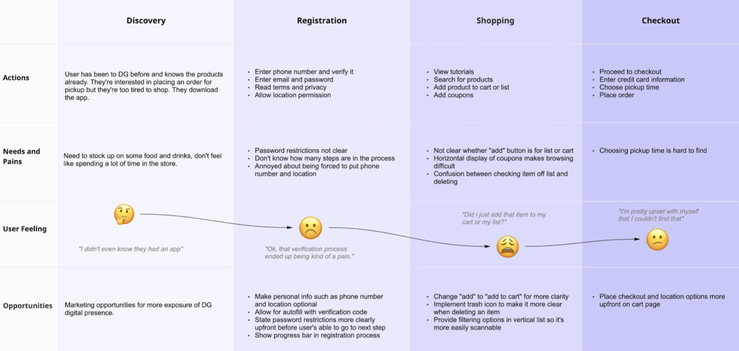
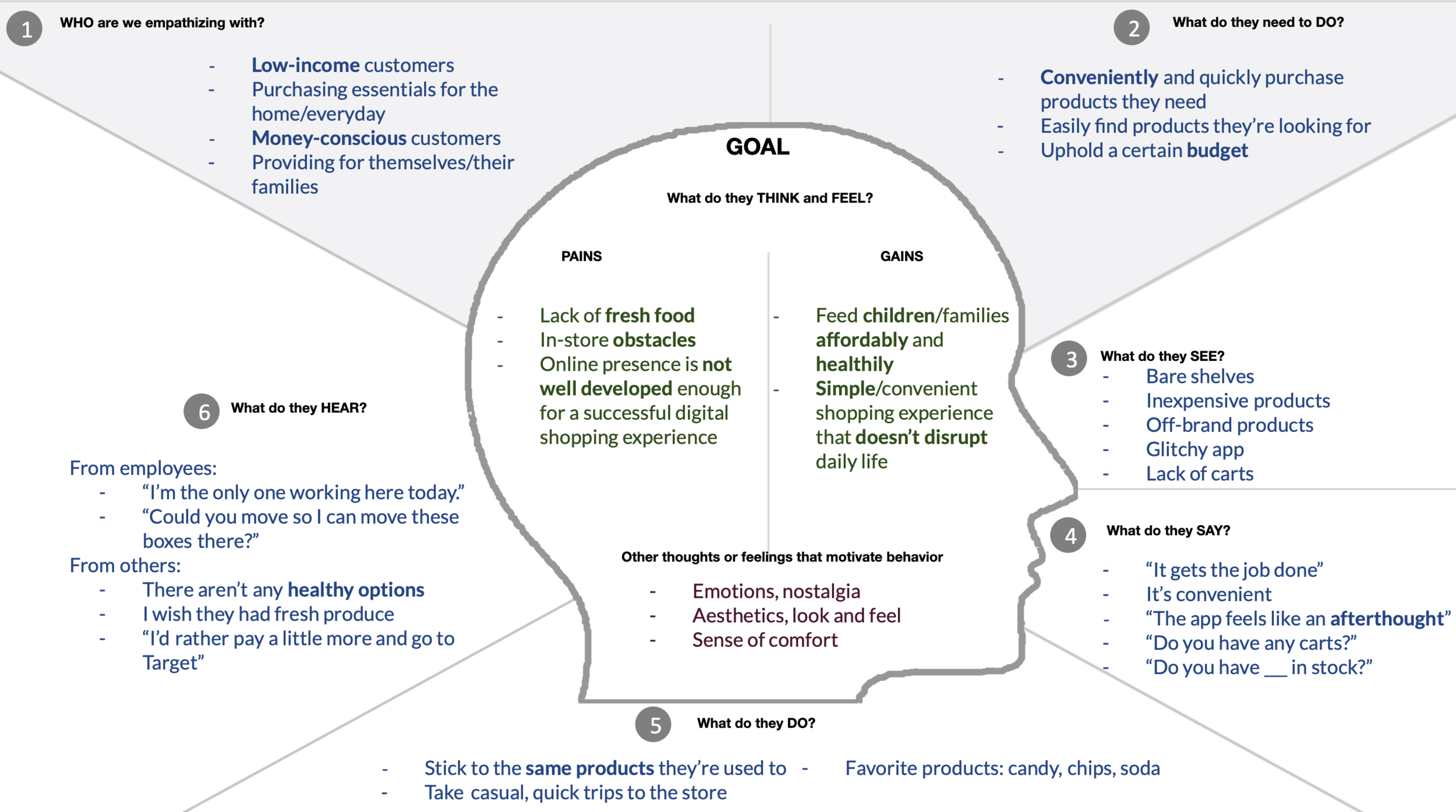
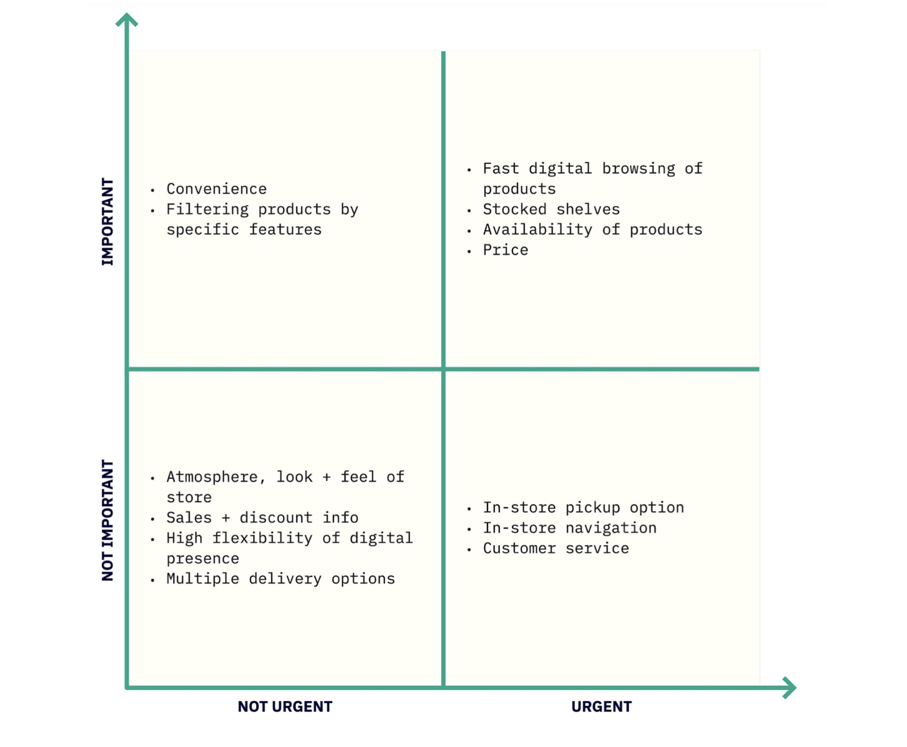
Key Insights
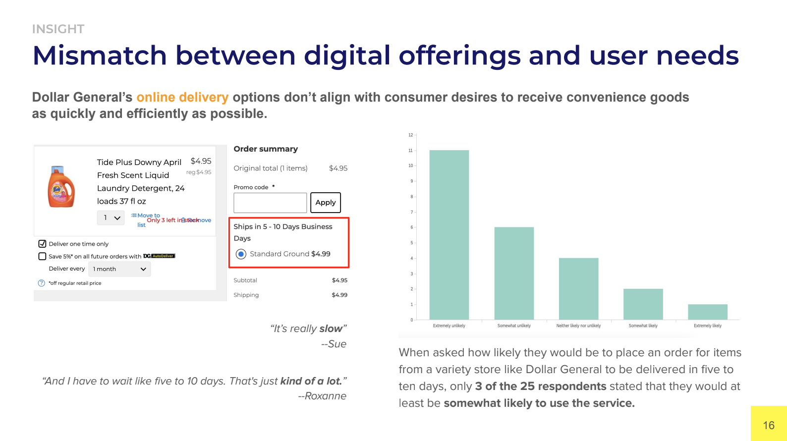
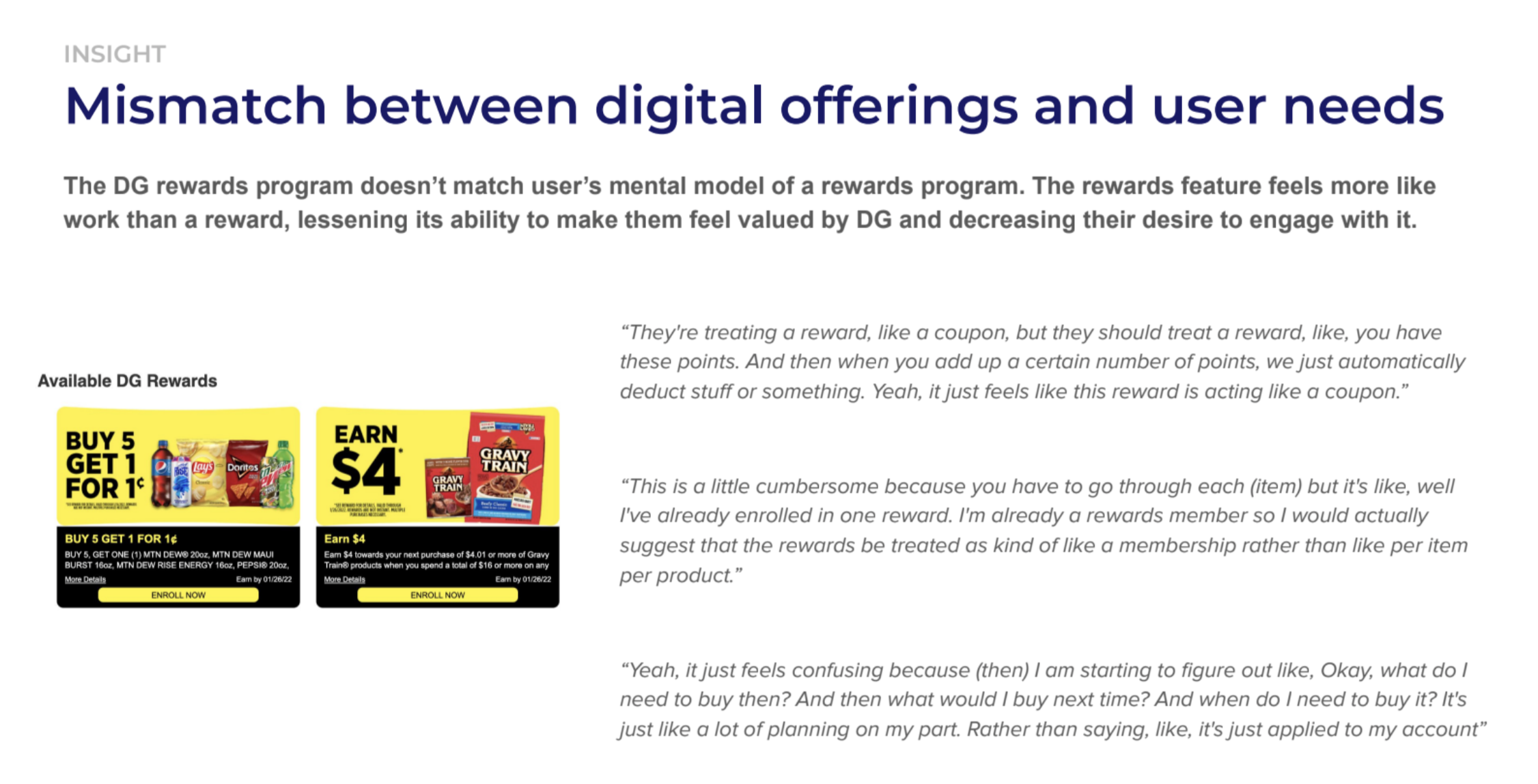
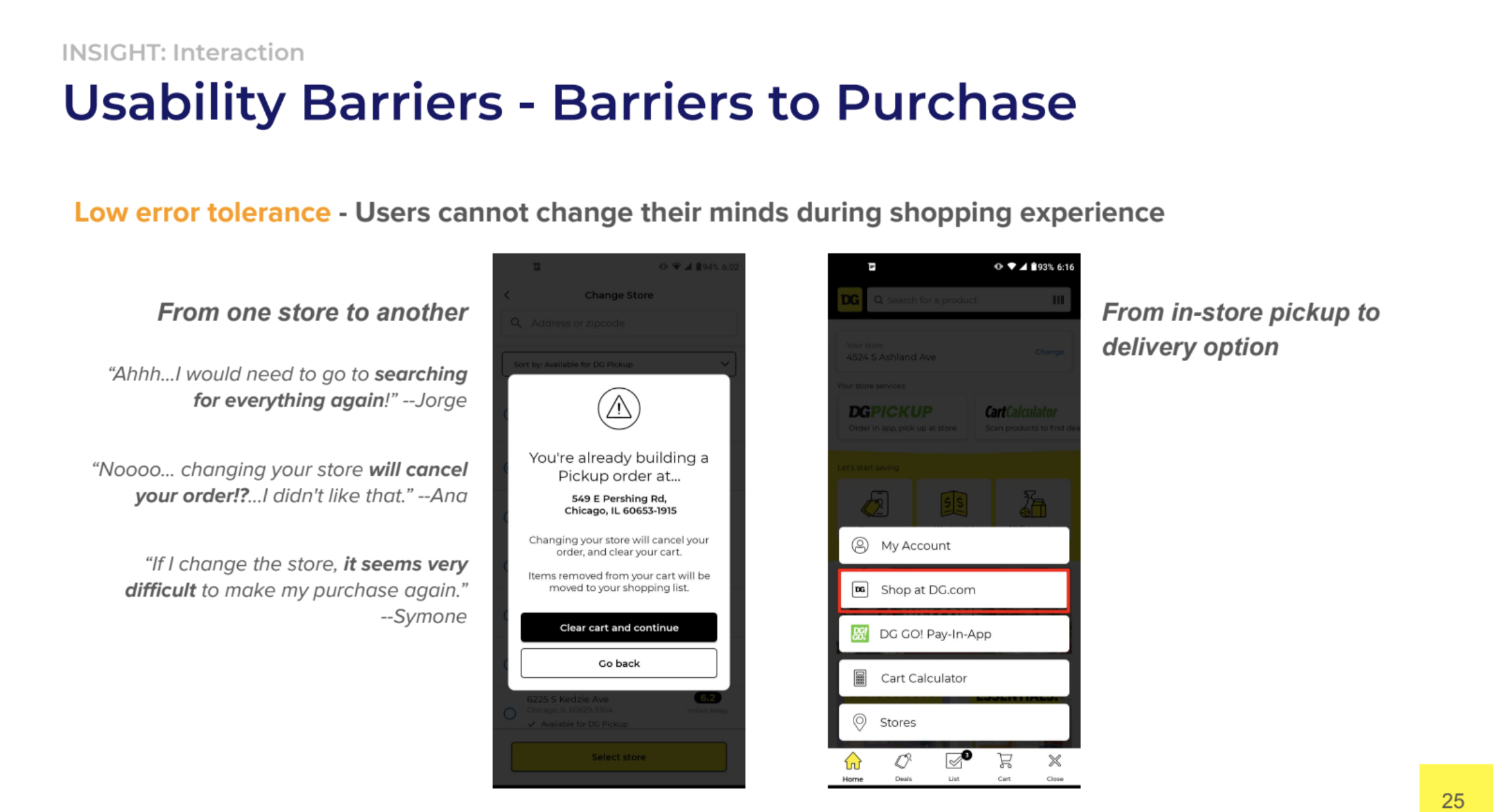
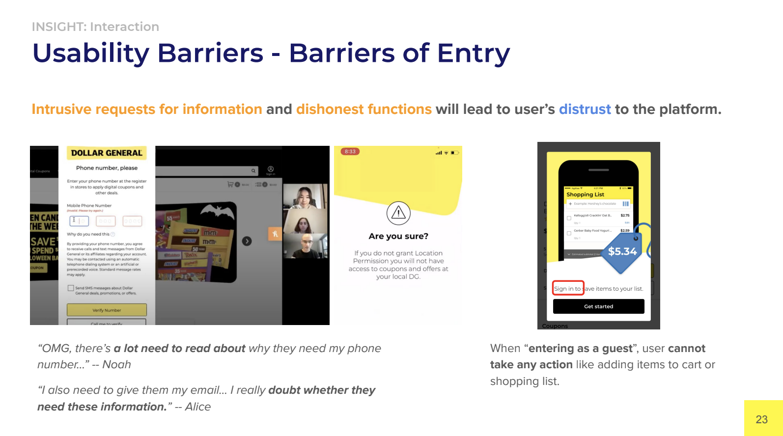
Our team presented (to the class) the findings to help the potential stakeholders see the problems differently. Our key insights revolve around a mismatch between digital offerings and user needs, and usability barriers.
Recommendations
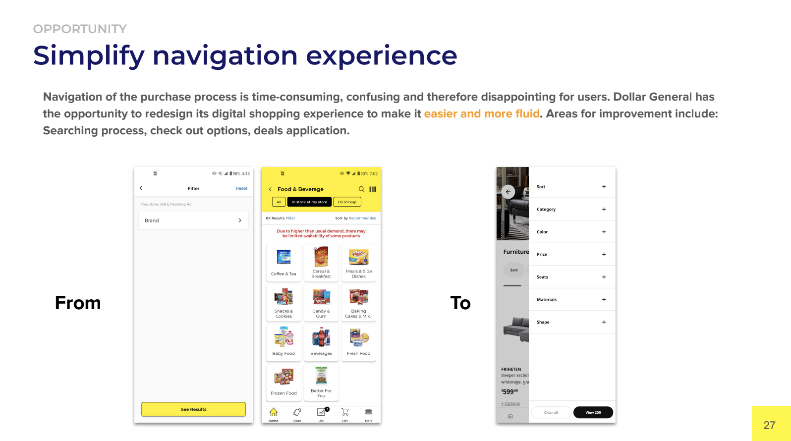
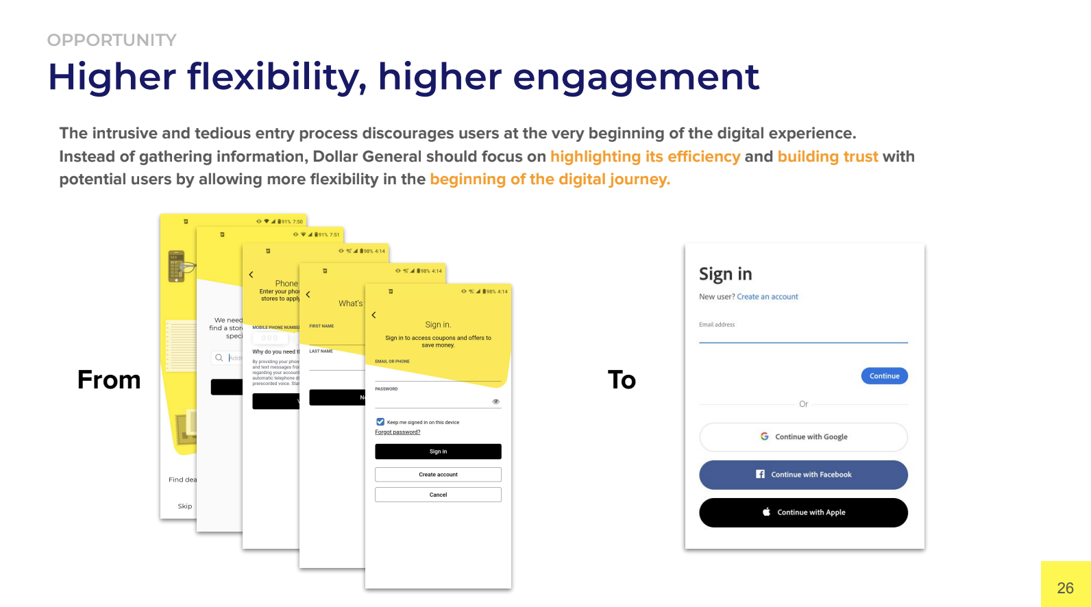
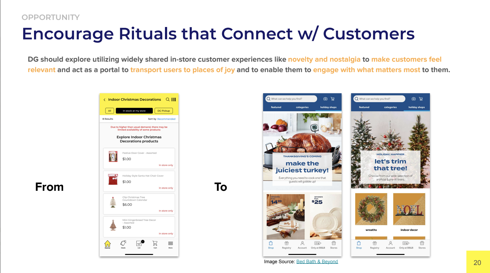
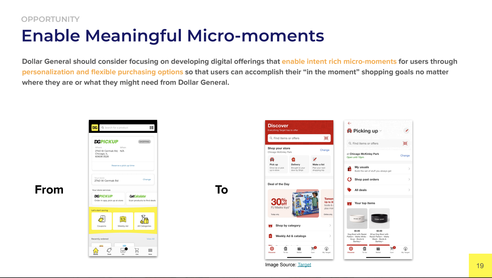
Through the insights, we formed design recommendations for Dollar General. First, we presented opportunities:
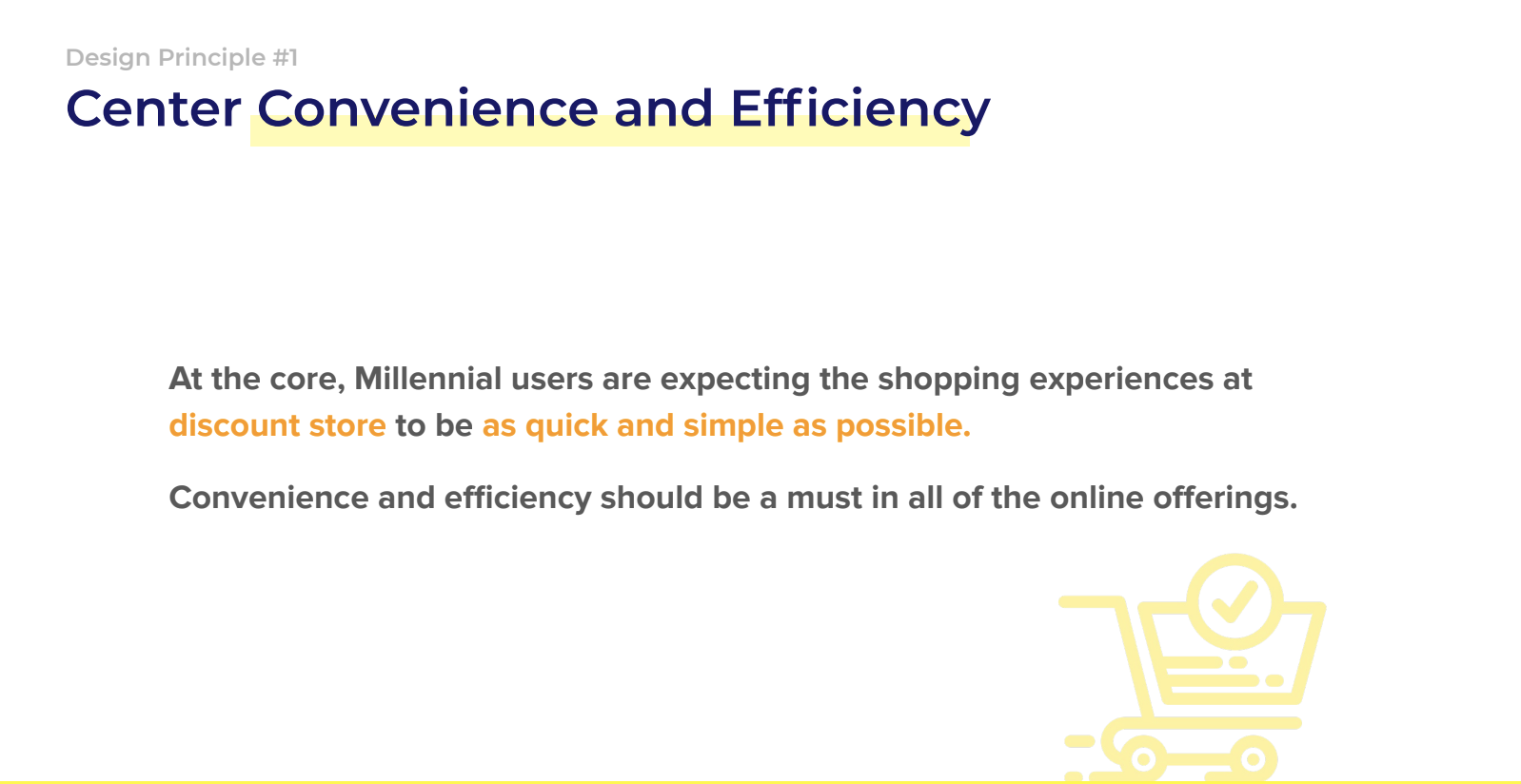
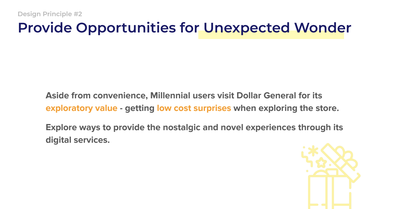
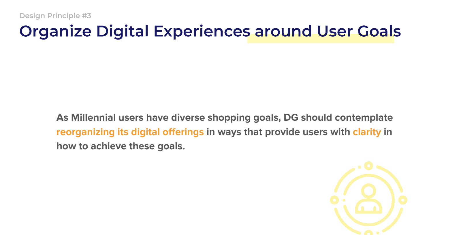
Next, we presented the following design principles:
Reflection
It takes empathy and prioritizing the needs of the user to accomplish good UX research.
“I am not the user” - don’t let personal preferences or biases guide the decision-making.
You can’t improve what you can’t measure.

