Task
Improve the online experience of an existing retail store, Bentley's Pet Stuff.
Solution
I designed a website that is easy to navigate and allows the user to quickly and efficiently checkout their items.
Deliverables
Sitemap, User Flow, Sketches, Wireframes, and a hi-fidelity clickable prototype.
Bentley's Pet Stuff is a nice pet store chain selling healthy products for dogs and cats. They have 87 storefronts in the US.
Research
To fully understand the Bentley's experience, I conducted a Walk-A-Mile study where I went to the store located in Evanston and explored the store's products and services. Through this journey, I found the pathways in the store confusing, signs misplaced, and too many options for food and toys making the selection difficult. I was determined to address these issues in my solution.
With my classmates, I conducted competitive analysis with other pet stores such as Kriser's and Petsmart, and compared factors such as partnerships, cost structures, value propositions, key activities, channels, customer relationships, revenue streams, and more.
Problem
After creating a journey map and fully analyzing my in-store experience and other research, I surmised the most important needs for a customer in the Bentley's online experience:
The user needs to save time entering information so that he/she is not deterred from purchasing products.
The user needs to narrow down the sort options so he/she is not spending more time than necessary searching for items.
The user needs clear pathways to checkout without leaving the website.
Target User
The target user for the website I have designed is a pet owner who views his or her pet(s) as a member of the family and seeks to provide them with the highest quality products. And that's what Bentley's brand is all about. Frequent customers are generally better off than most since products tend to be pricier than their off brand alternatives.
Design Process
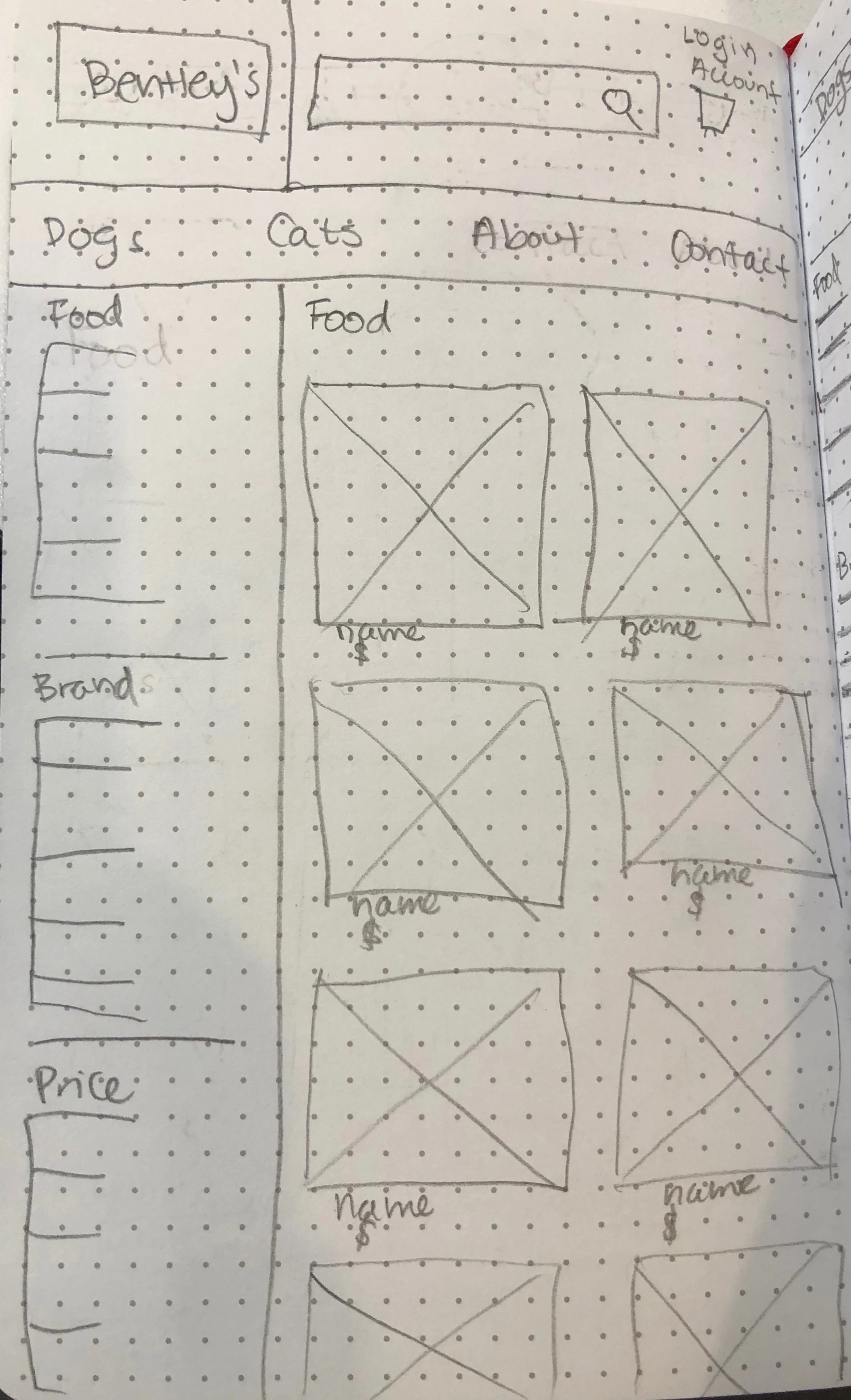
I thought about the most important categories at a store are, and decided on the following categories for the sitemap: search, dogs, cats, contact, about us, and account. Next, I designed the rest of the site architecture based on further necessary pages for the user flow.
The user flow details the routes the user could logically take while navigating the site. It addresses the problems that face the consumer in an in person experience
In my initial sketches, my homepage only contained call to action buttons to shop for certain categories and the brands that Bentley’s sells. Although I’m trying to mainly solve organizational issues to help the user purchase products, the brand identity is an aspect of any company that is important and is what sets it apart from others.

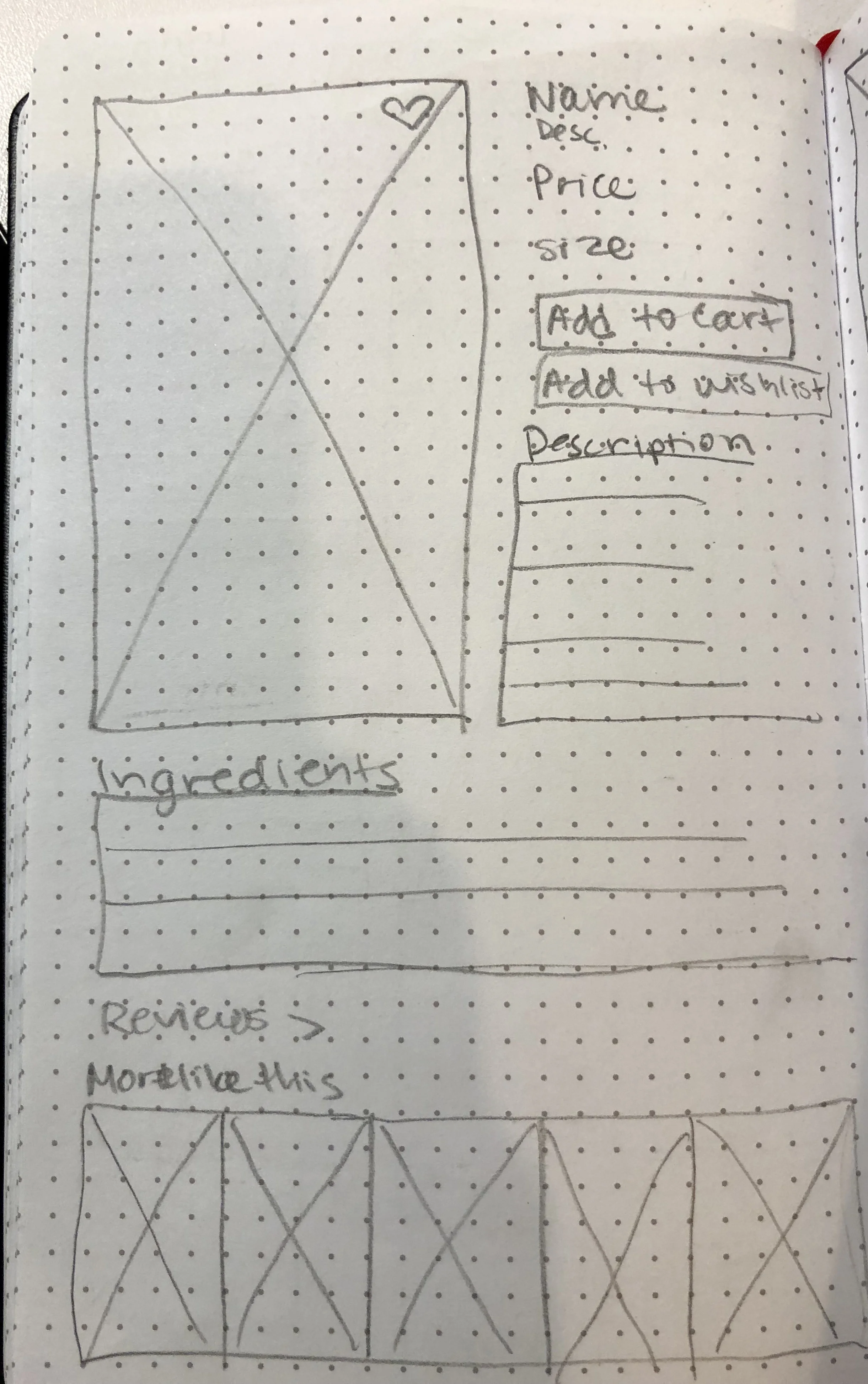
In the wireframe of my homepage, I decided to add a health section to feature more of the Bentley’s brand. But after receiving user feedback, I realized the health section didn’t make sense since all of their products are healthy. Furthermore the section disrupts the flow of the homepage and doesn’t relate well to the rest. It didn’t seem as if it was associated with the brand upon seeing it.


Prototype
This is the final prototype of the homepage. As you can see, I removed the health section and replaced it with a tidbit about the brand so that the page flows more seamlessly, and you get a clearer picture of what Bentley’s is about in this space, while maintaining easy access to products. Users reacted positively to this change.
Watch the video below to see how a typical Bentley's customer, Sally, experiences the website. Sally has been to the Bentley’s site and has previously entered her information. She is familiar with Bentley’s products. She knows she likes certain types of food for her dog and cat, but can’t remember exactly which ones they are.
After testing the prototype with users, I received valuable information to improve clarity and ease of the user experience through the site such as a bolder notification of the number of items in your cart and confusing placements of messages to the user.
Next Steps
With more time on this project, I would continue with user testing to see what else I can do to make the process as simple and clear as possible. I would also want to incorporate more advanced filtering as well as a wishlist feature.